ZenStock
A stock simulation app that strips trading down to its essentials — buy, sell, learn — so beginners can build confidence without the noise of traditional platforms.
UX Case Study · 8 Weeks · Sole Designer · Figma, Miro
The Problem

Every major trading app — Robinhood, Webull, E*Trade — is built for people who already know what they're doing. The interfaces are dense, the language is jargon-heavy, and the stakes are real money from day one. For someone who just wants to understand how markets work, the barrier is enormous.
ZenStock asks a different question: what if a trading app did nothing except teach you to trade? No crypto, no options chains, no social feeds. Just stocks, a simulated portfolio, and the space to make mistakes without consequences.
Research
The target user is Jimmy — 21, a student in Austin, juggling coursework and a part-time job. He has maybe 15 minutes a day to think about investing. He's heard about stocks from friends and TikTok but opens Robinhood and feels lost within seconds. He doesn't need a Bloomberg terminal. He needs training wheels.
“I don't have enough hours in a day to get all my work done, so I need an app that moves as fast as me.”
— Jimmy, user persona
His goals: start learning to invest early, trade from his phone in short bursts, and compare progress with friends. His frustrations: too much complexity, information overload, and distractions from crypto and meme stocks that pull attention away from fundamentals. This tension — wanting to learn but being overwhelmed by existing tools — became the core design constraint.
The user story that emerged: “As a student on the go, I want to manage my investments in a short amount of time so I can learn about investing from an early age.”
Design Philosophy
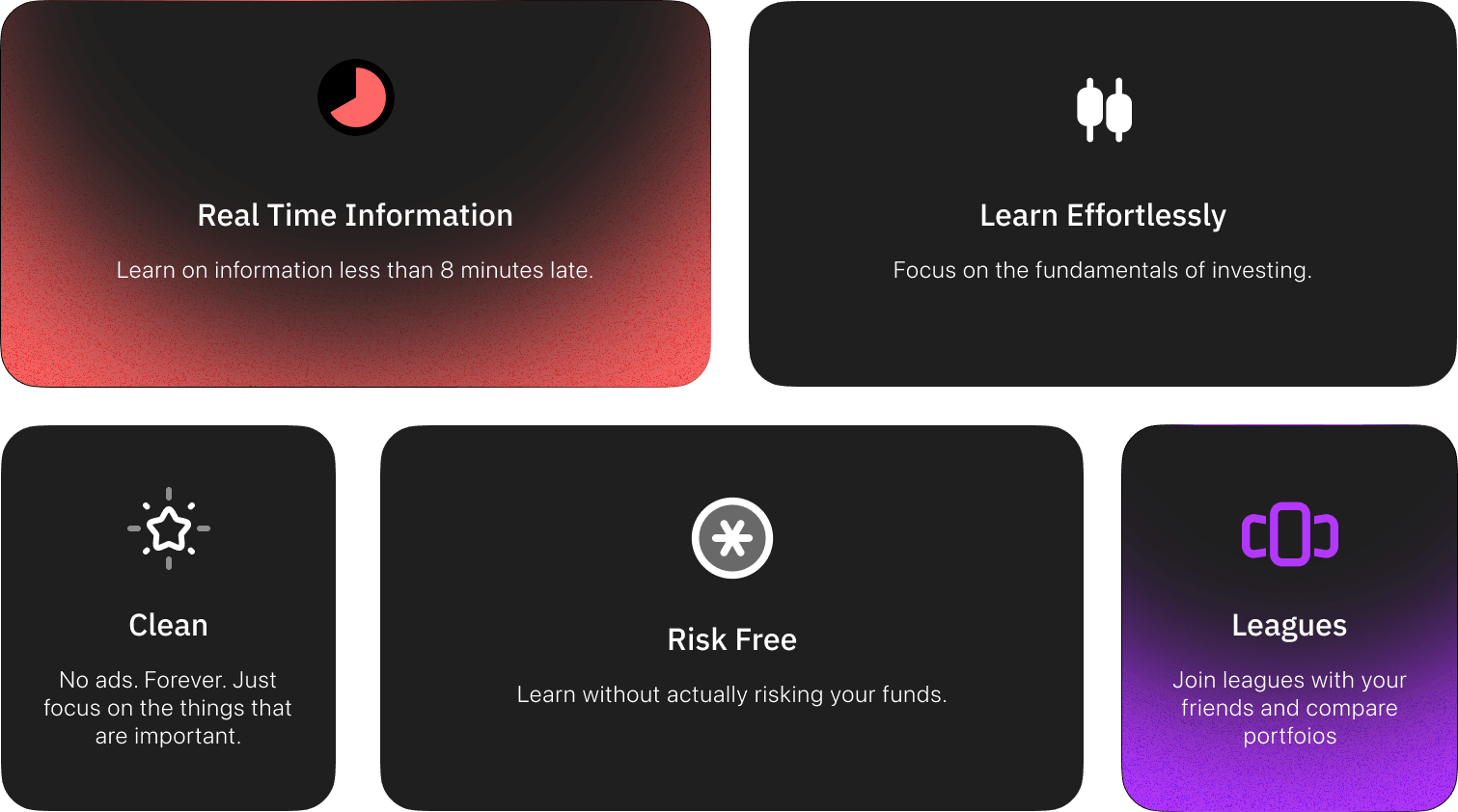
The guiding principle was radical reduction. Most fintech apps add features to compete. ZenStock removes them. The app's philosophy is to be a stock simulation and nothing else — provide concise, relevant information for buying and selling, then get out of the way. Users can do deeper research elsewhere. This isn't a limitation; it's the product.
Four principles drove every screen: minimalist interface — only essential trading functions, nothing decorative; quick actions — buy and sell optimized for mobile thumbs; essential information only — concise data without the noise; and learning through doing — a simulation environment where experimentation has zero risk.
Design System
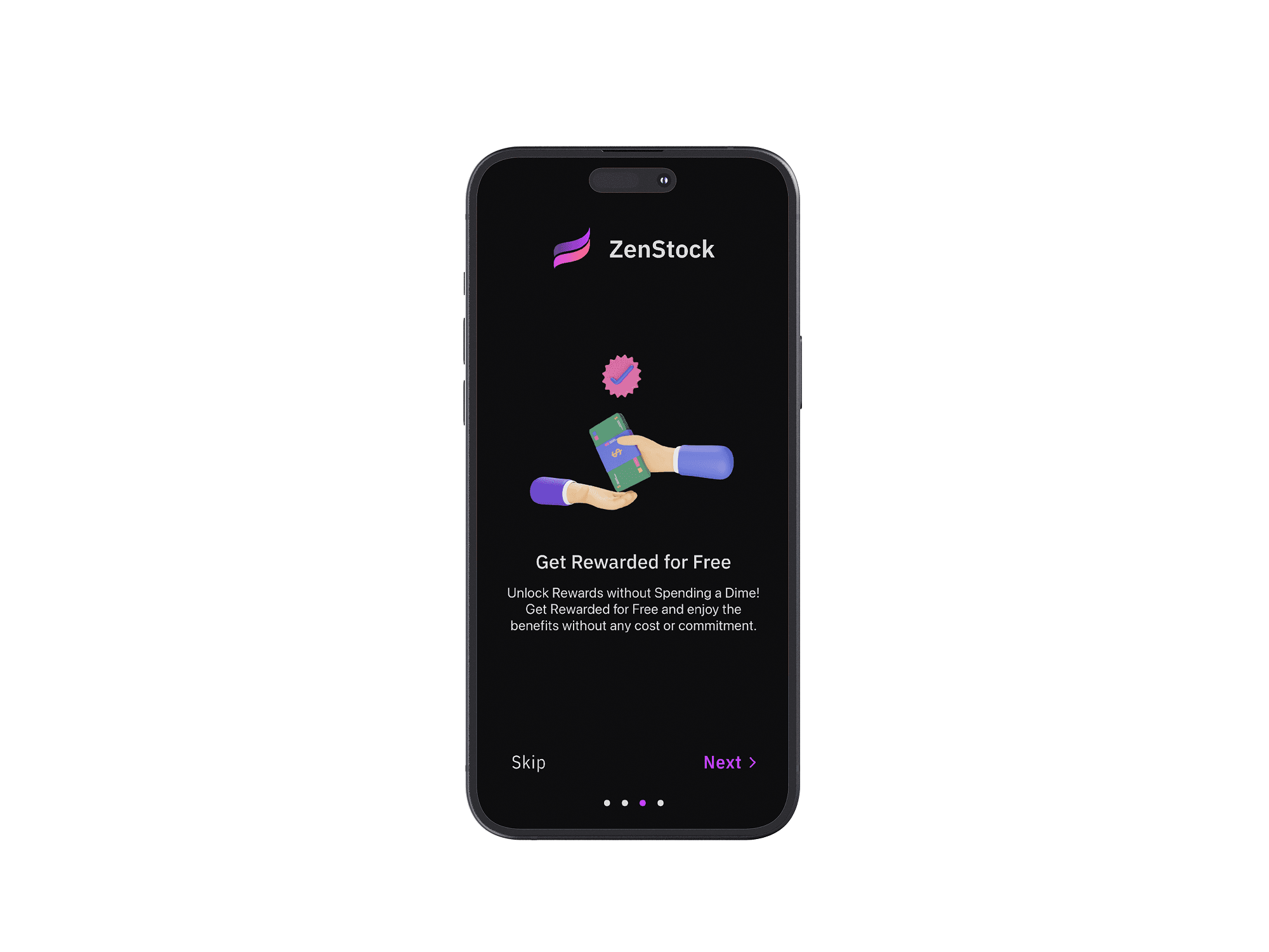
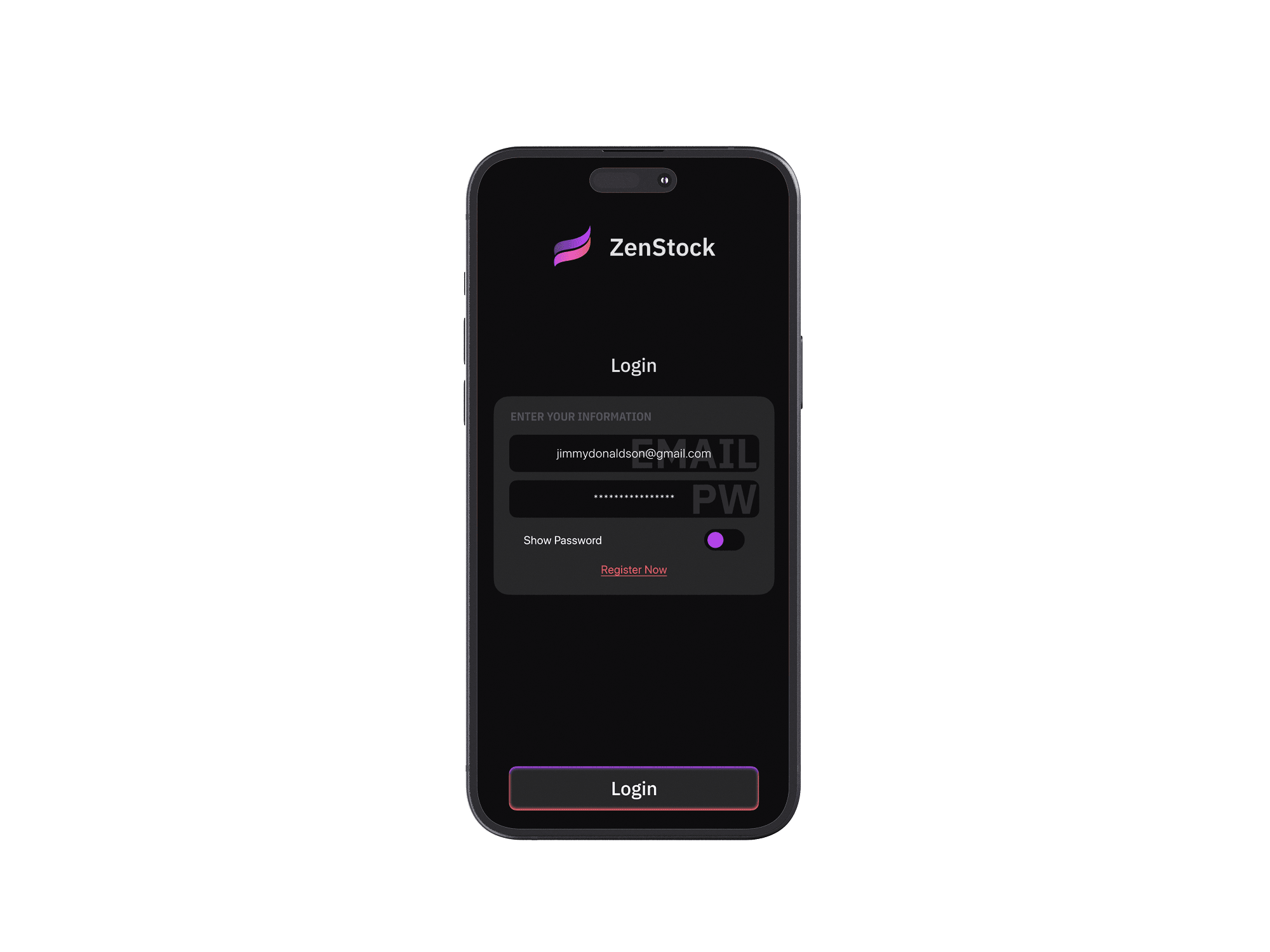
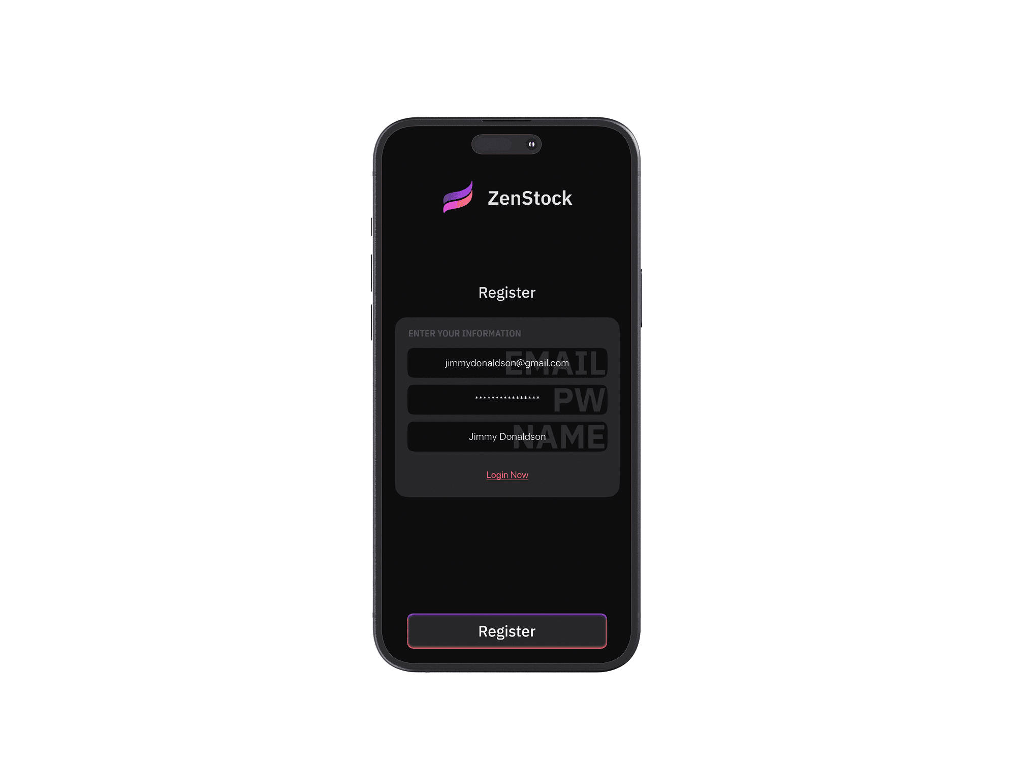
ZenStock uses a dark-first palette — black and dark gray for backgrounds, white for primary text, with red and purple as the only accent colors. Red signals action (buy, sell, alerts), purple marks highlights and secondary interactions. The restraint is intentional: fewer colors mean fewer decisions for the user's eye.
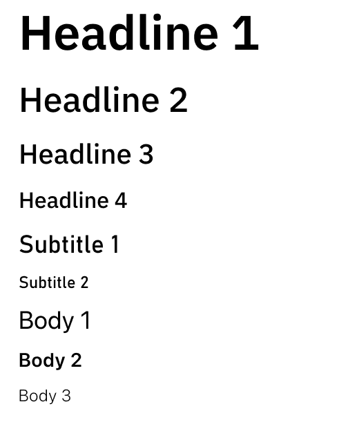
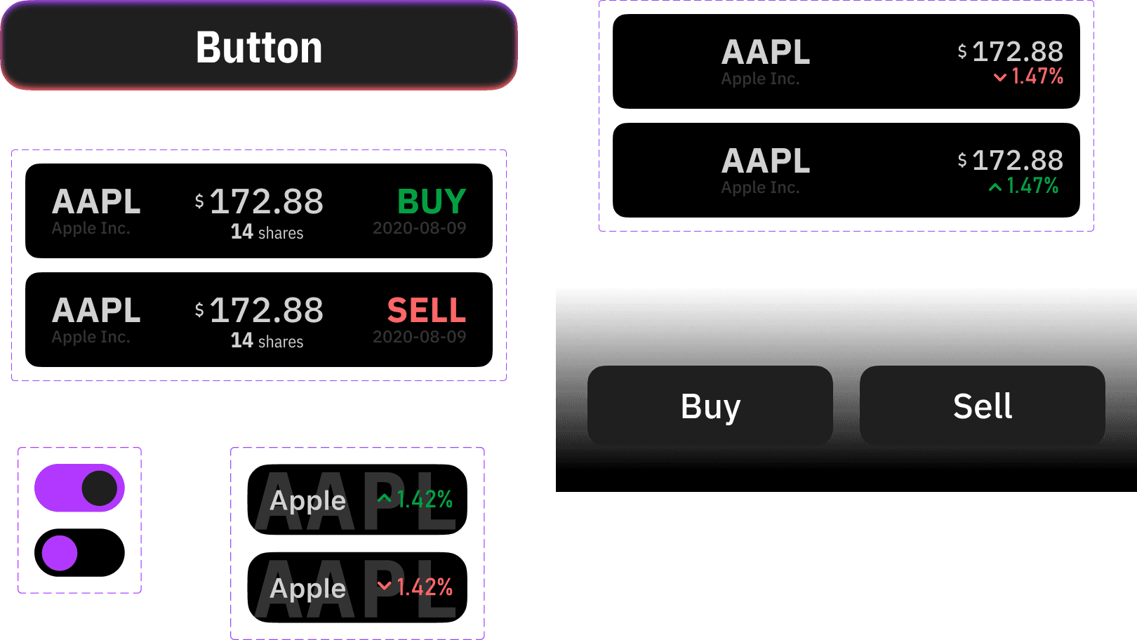
Type scale and core UI components.
Key Flows
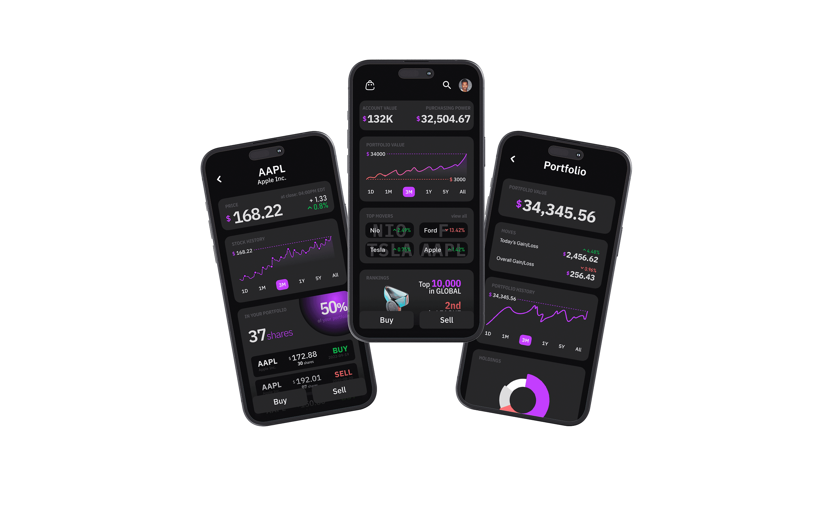
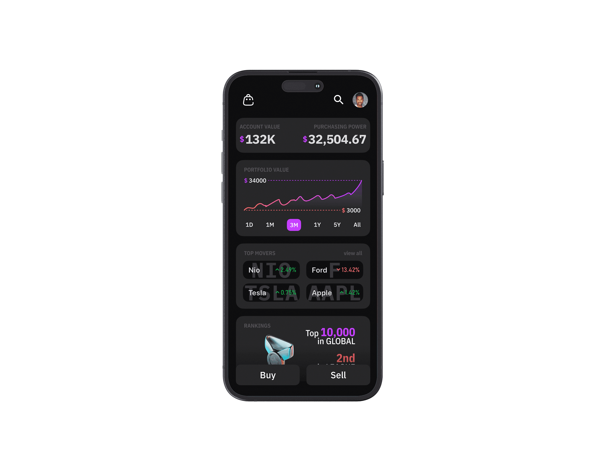
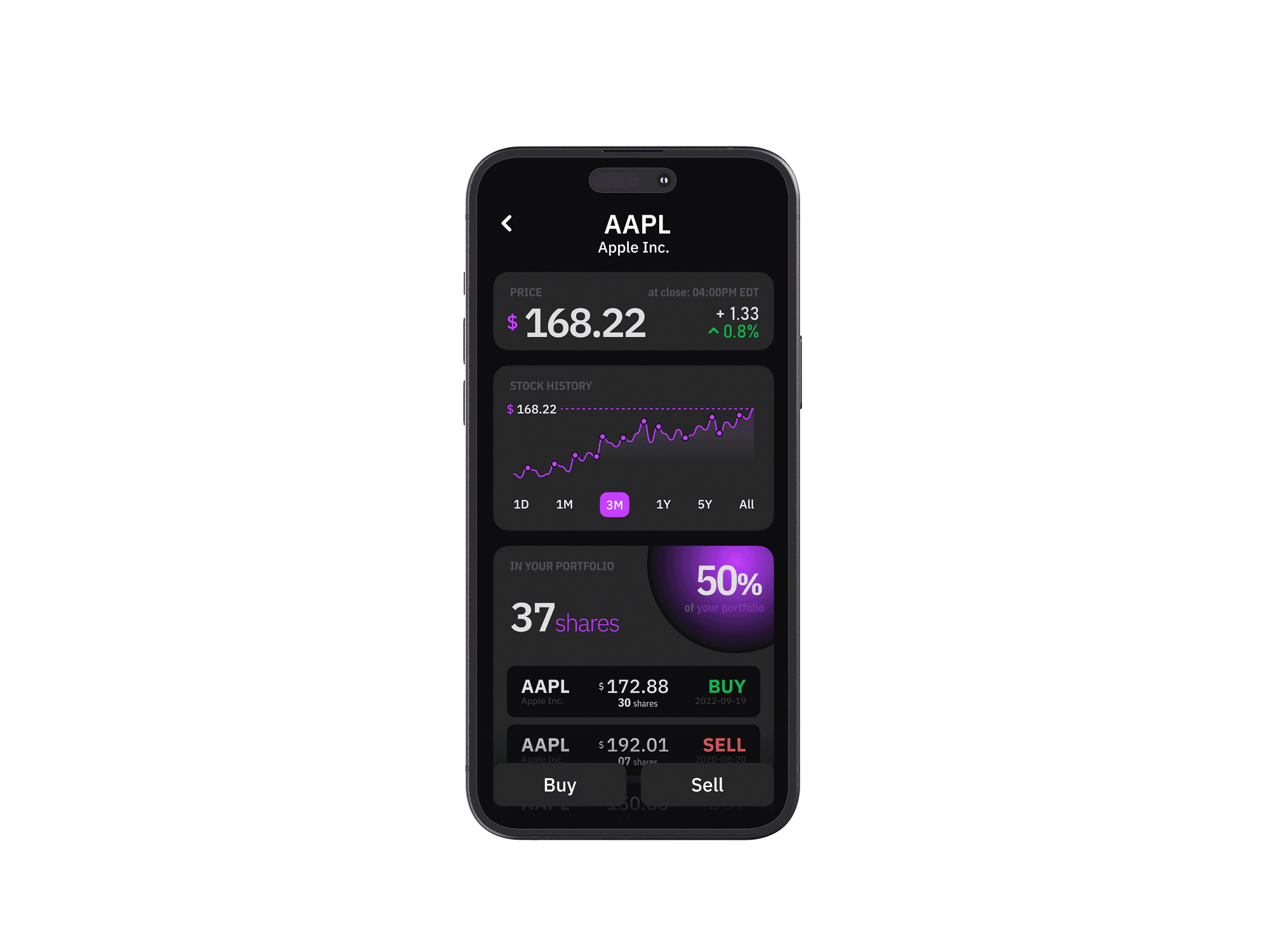
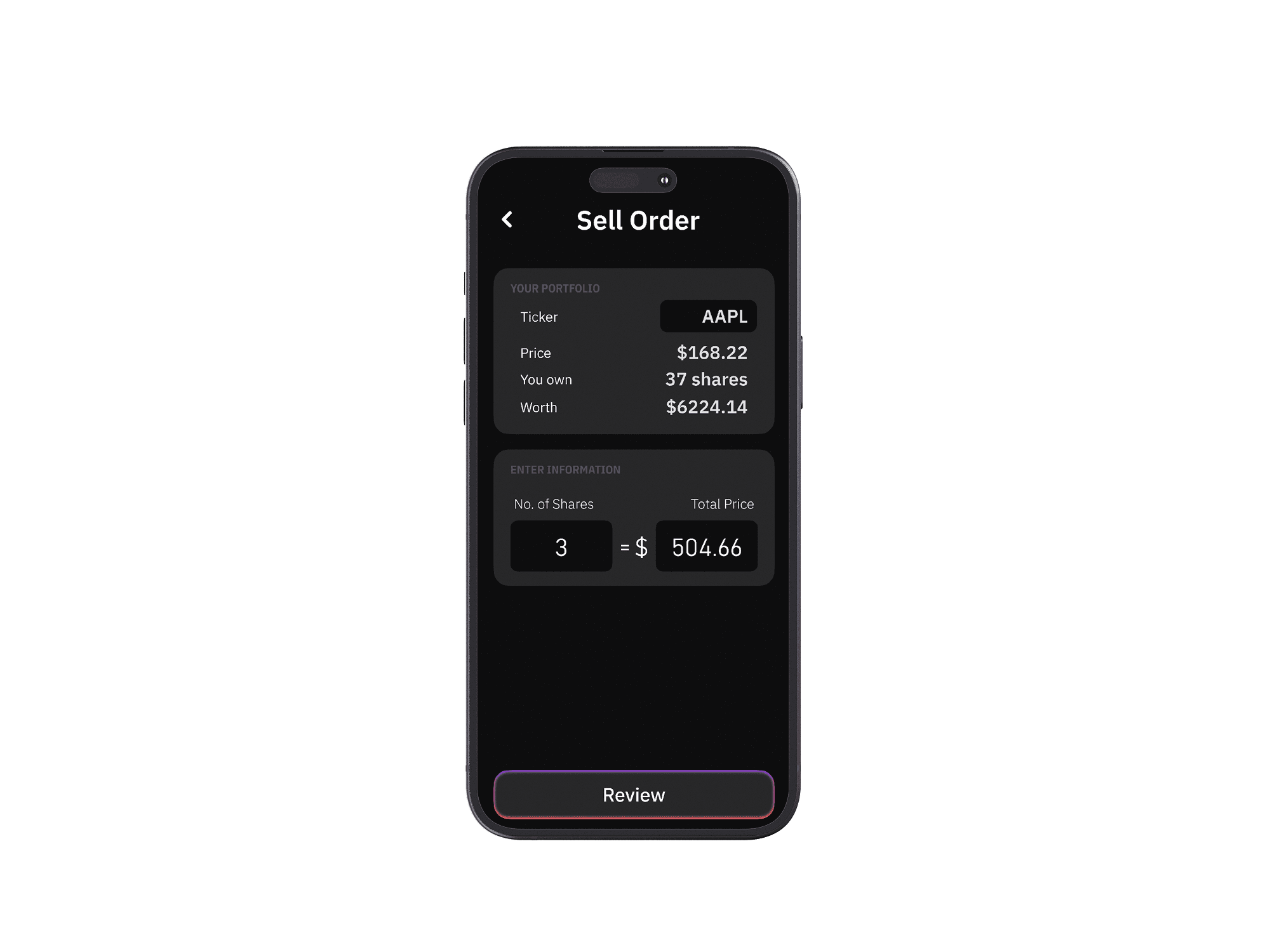
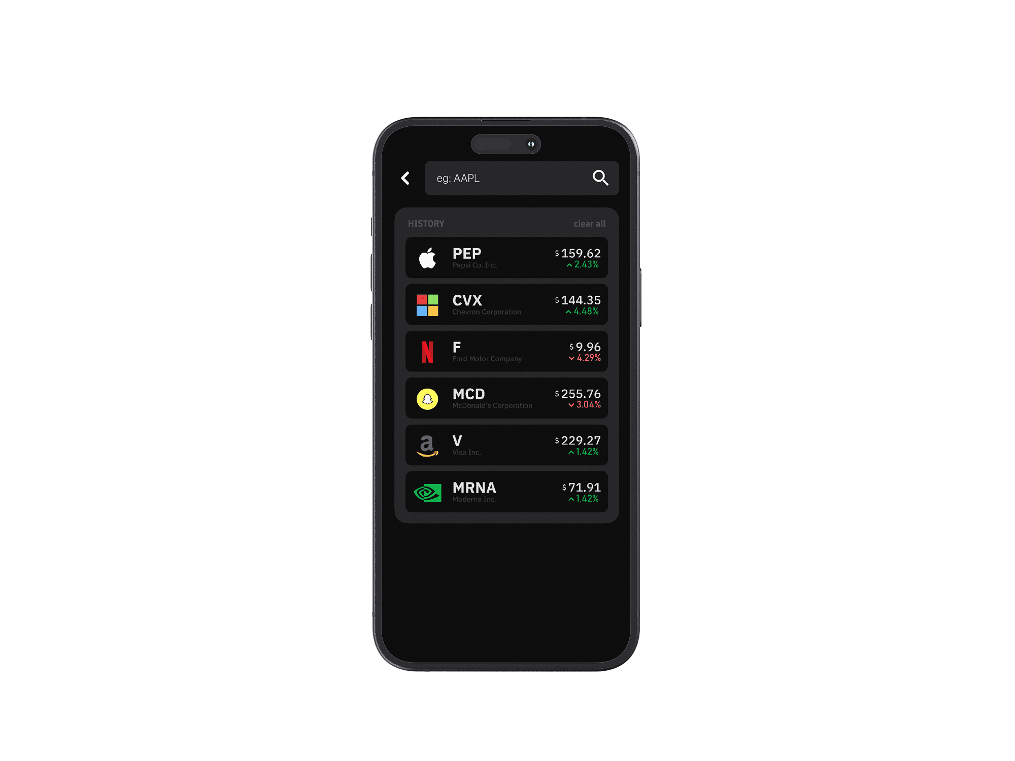
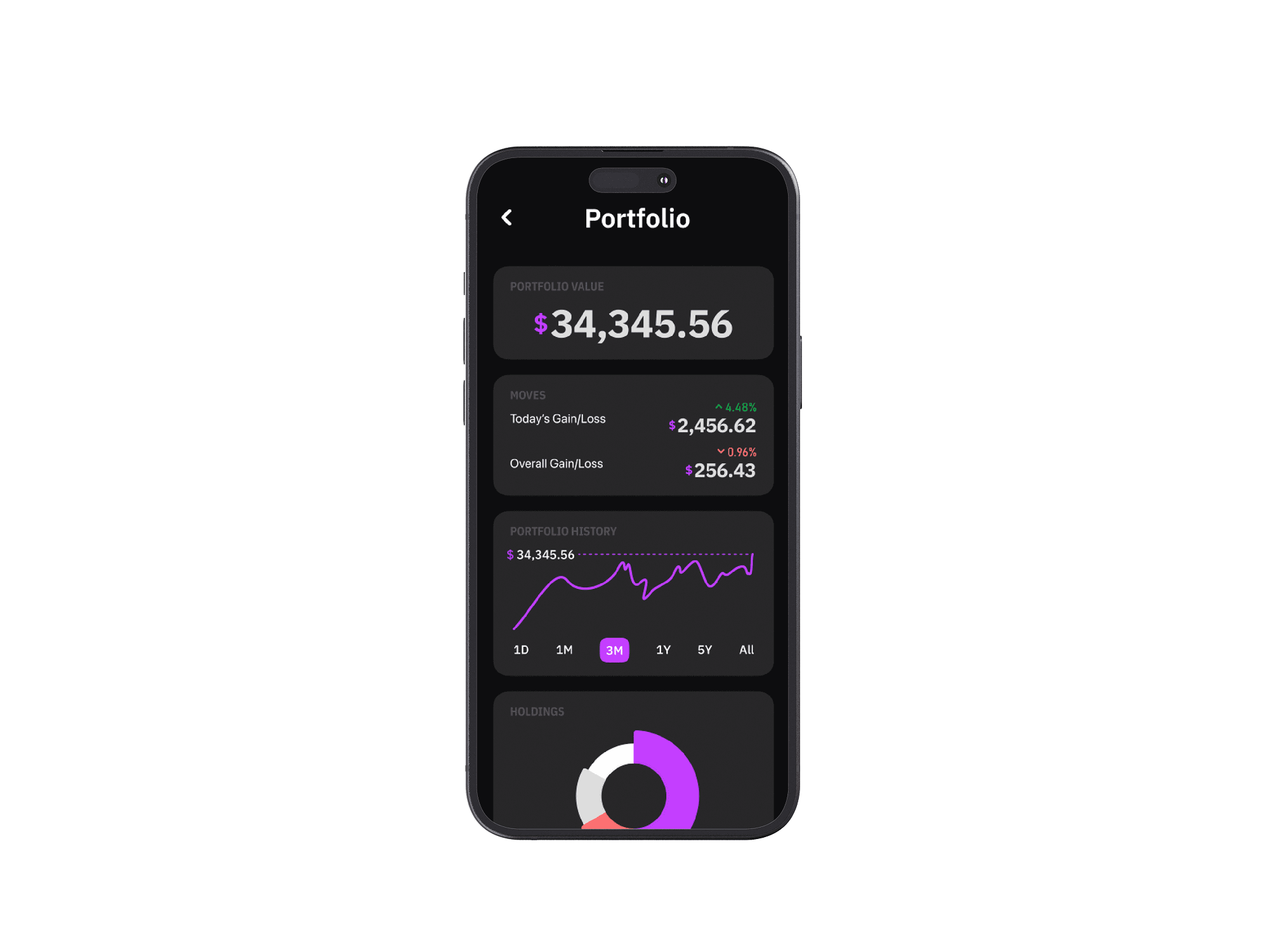
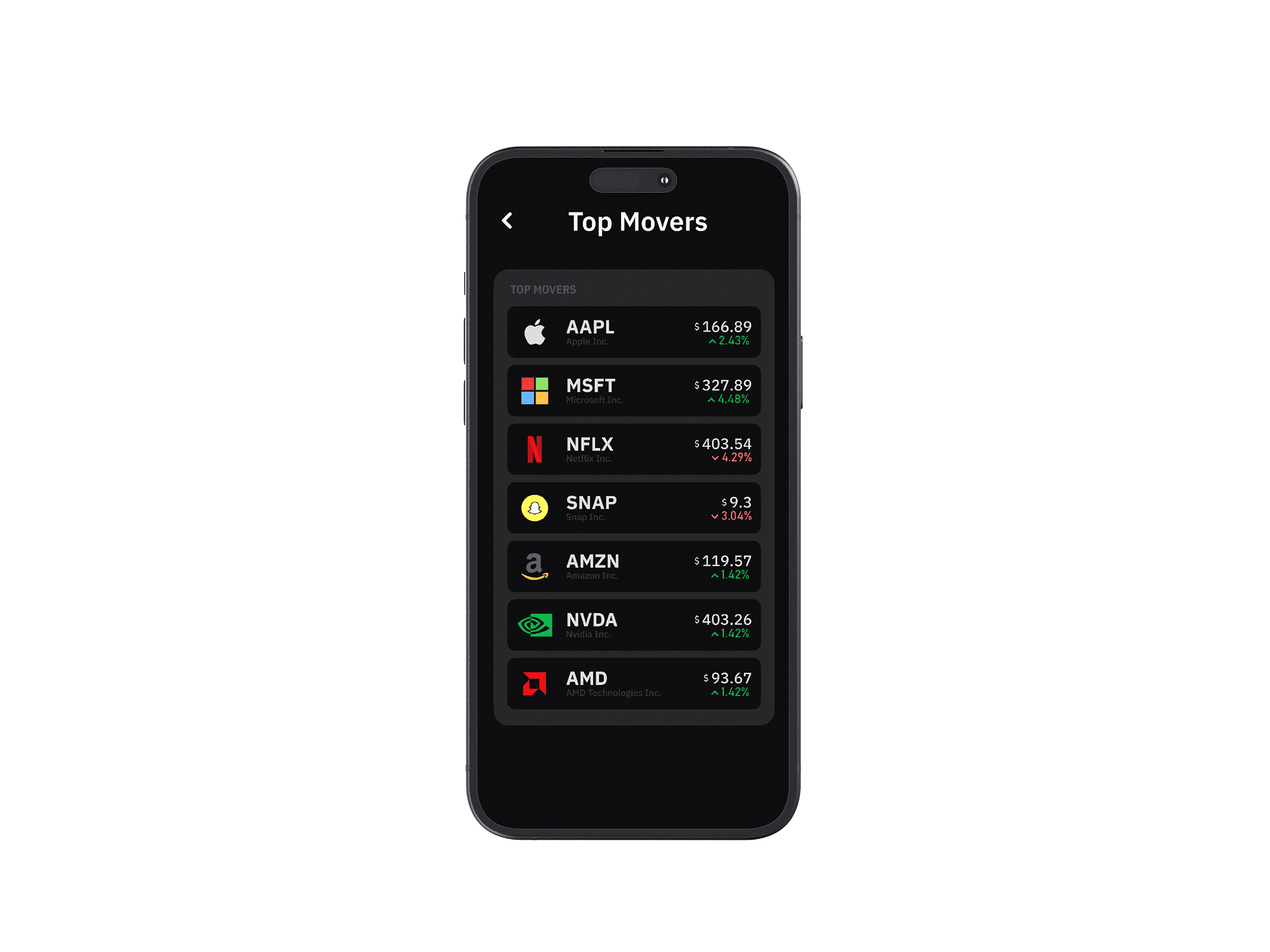
The information architecture is flat on purpose — a four-tab structure (Home, Search, Portfolio, Profile) keeps every destination one tap away. The home screen surfaces a portfolio snapshot and top movers. Search lets users find any stock and drill into a detail view with price history, a simple chart, and two buttons: Buy and Sell.
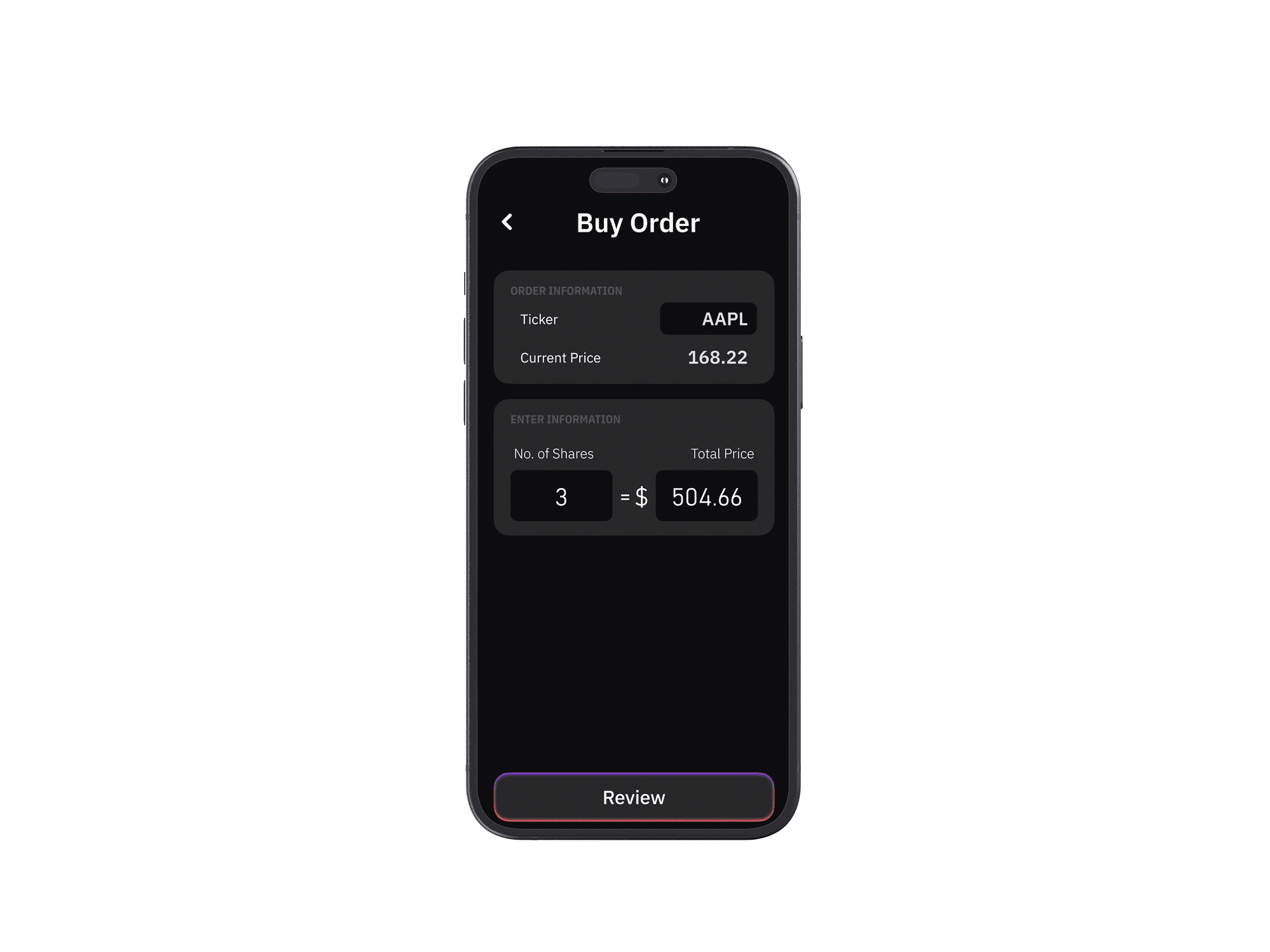
The buy/sell flow is stripped to its minimum: select a stock, enter a quantity, review, confirm. Three steps. No hidden fees, no advanced order types, no margin. The simulation wallet starts with virtual cash, so first-time users can place a trade within 30 seconds of signing up.
Core feature mapping across the four-tab structure.
What Makes It Different
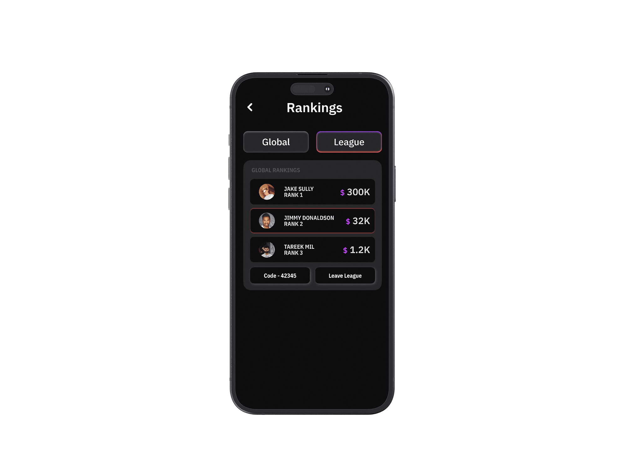
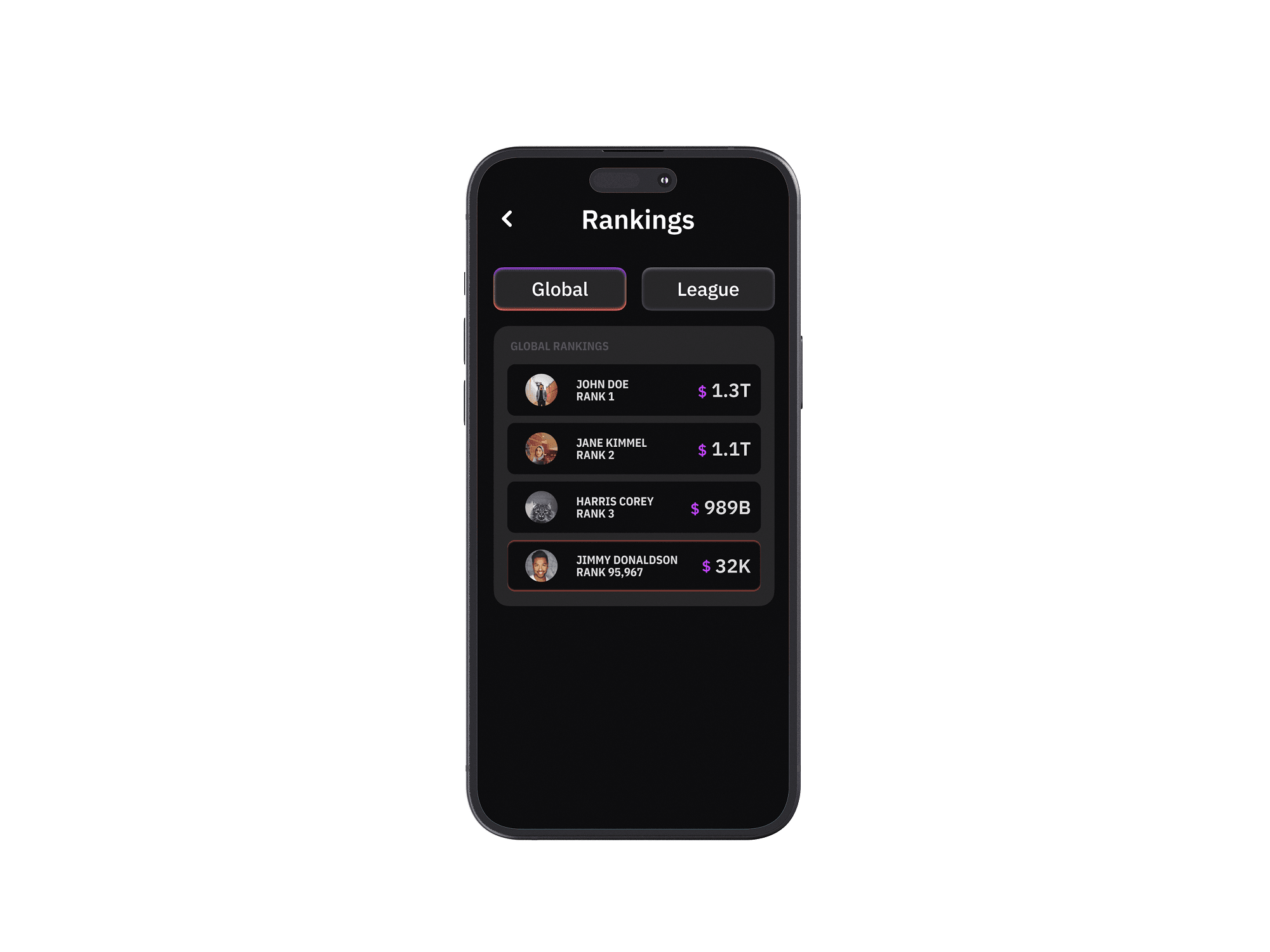
A league system adds a social layer without turning the app into a social network. Users compete on simulated returns with friends, introducing friendly pressure to research and think before trading. Rankings update weekly, and the leaderboard is deliberately small — your circle, not the world — to keep motivation personal rather than performative.
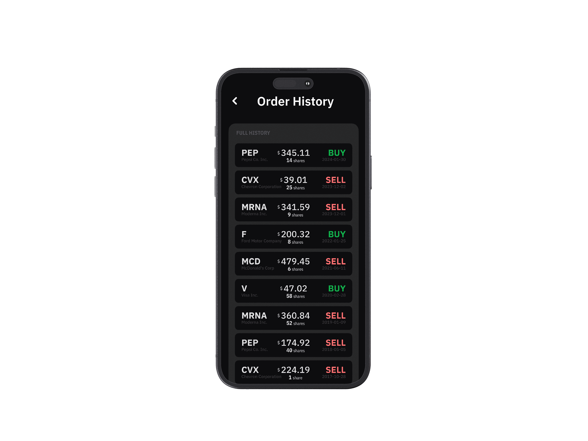
Transaction history is visible but minimal: date, stock, action, amount. No complex P&L charts. The assumption is that users at this stage benefit more from seeing patterns in their own behavior (am I panic-selling? holding too long?) than from granular financial metrics.
Screens

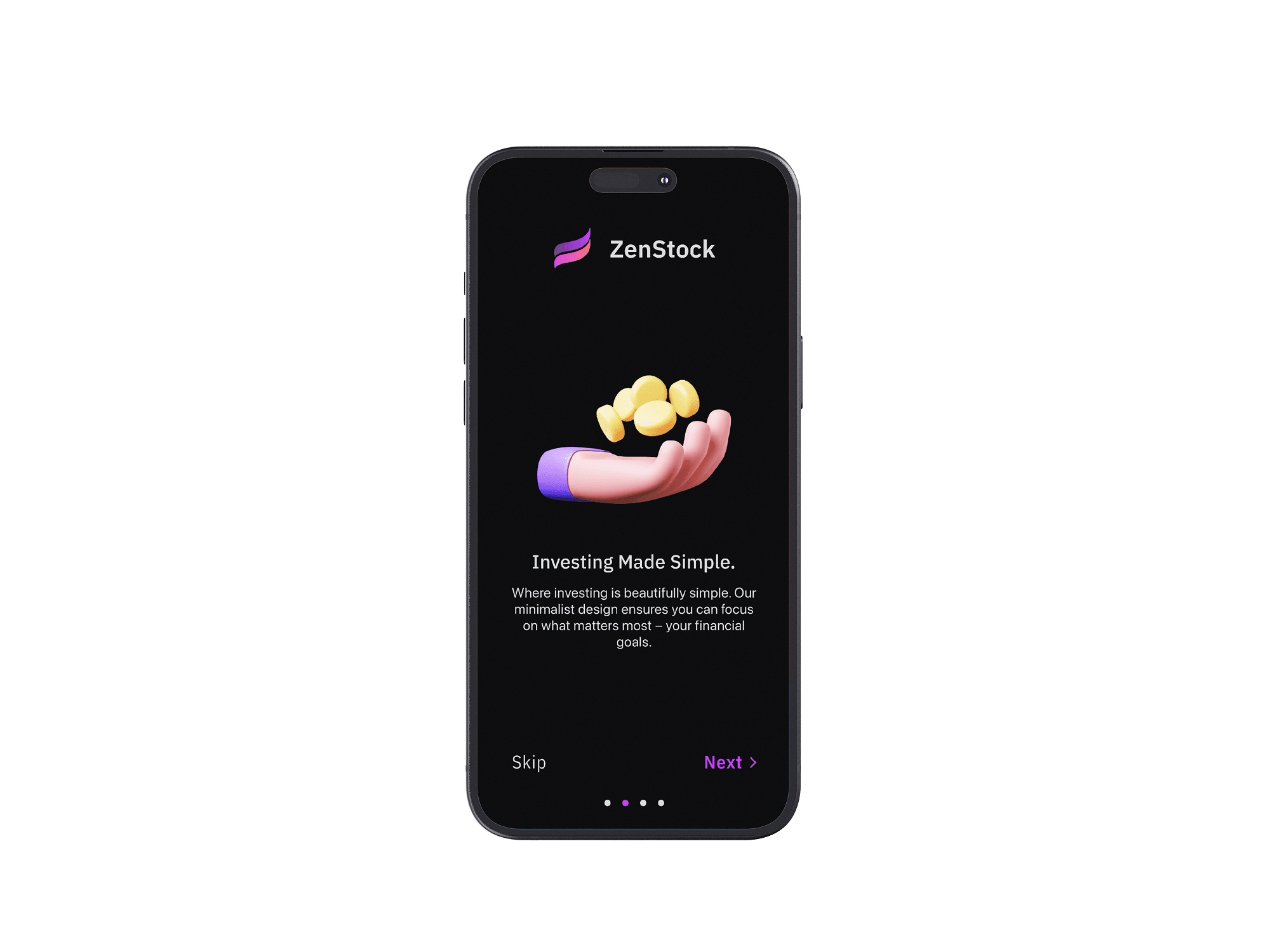
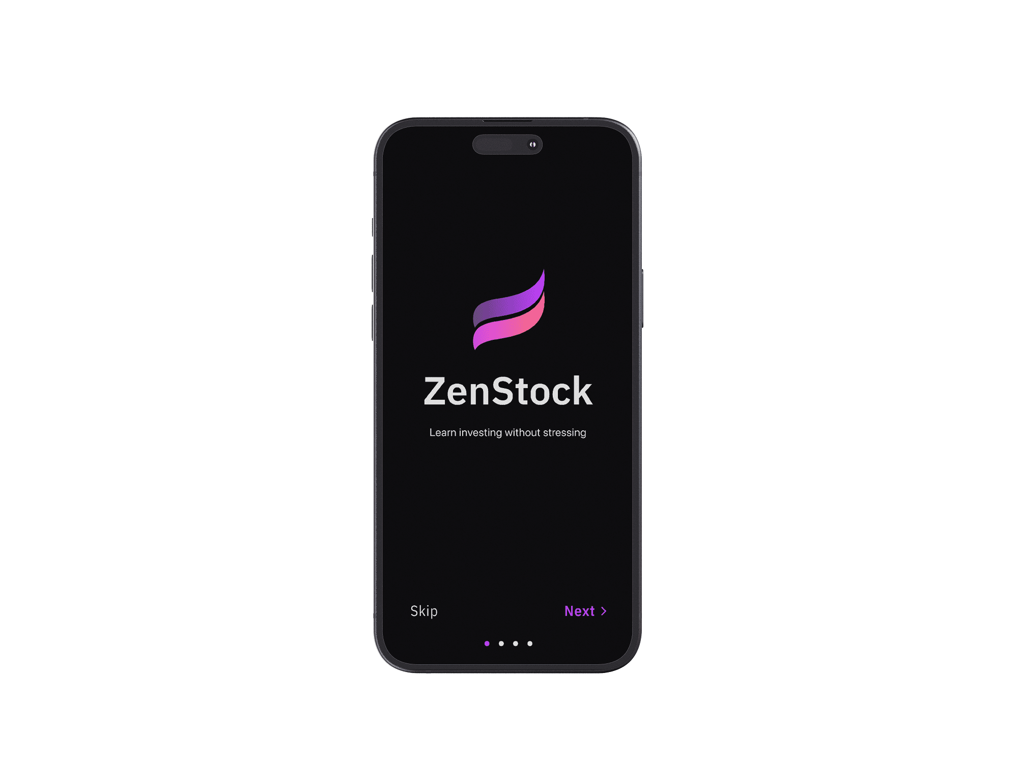
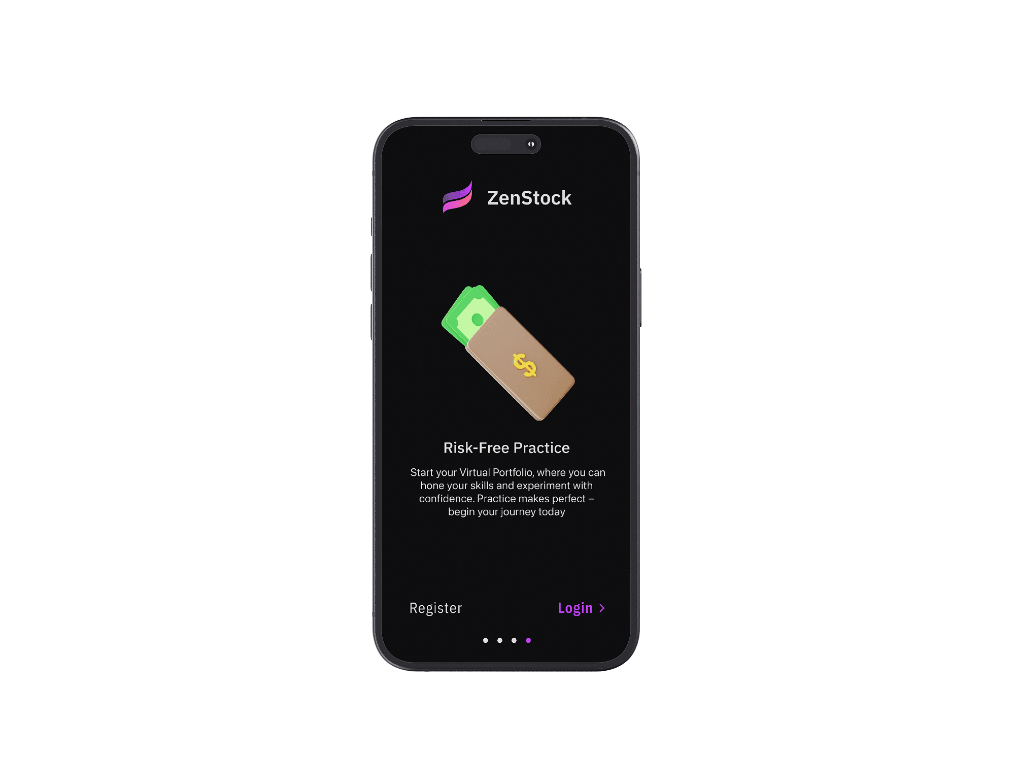
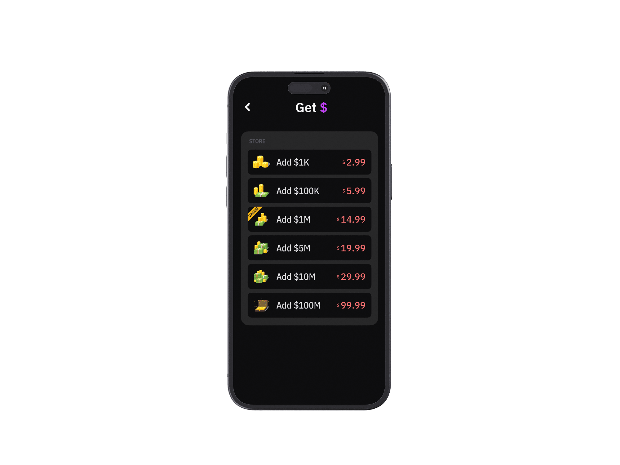
18 screens — click to enlarge.
Outcomes
The final deliverable is 18 high-fidelity screens covering onboarding, home, search, stock detail, buy/sell, portfolio, transaction history, league, rankings, and profile — alongside a complete design system with typography, color tokens, and reusable components.
The biggest takeaway was that removing features is harder than adding them. Every screen went through rounds of subtraction — stripping labels, collapsing sections, questioning whether each element earned its place. The result is an interface that feels calm in a category known for sensory overload.
Reflection
ZenStock taught me that constraint is a design tool, not a limitation. By narrowing the scope — simulation only, stocks only, essentials only — every decision became clearer. There was no ambiguity about what to prioritize because the product definition itself was the filter.
If I revisited this project, I'd invest more in onboarding — the current flow gets users in fast, but a guided first-trade experience could reduce early drop-off. I'd also explore haptic feedback for confirmations and micro-interactions that reinforce the “training wheels” metaphor. The 8-week timeline pushed me to ship a coherent system end-to-end, and that discipline — choosing depth over breadth — is the skill I'll carry forward.