CashCap
A saving-first e-wallet that uses gamification, behavioral nudges, and cognitive science to help users build better money habits.
HCI Case Study · 6 Weeks · Product Design & Research · Figma, Miro, Google Forms

Most e-wallets optimize for transactions — faster payments, more merchants, bigger volumes. But for many users — from students managing their first income to working adults with limited digital finance experience — the real challenge isn't spending. It's understanding where money goes and building the discipline to save.
CashCap addresses this gap with a clean interface that foregrounds savings goals through a virtual Piggy Bank, provides spending analytics that actually make sense, and applies HCI principles to reduce cognitive load at every step. The result is an e-wallet users trust, understand, and return to.
01
Study & Discover
The first two weeks were spent forming the team, reviewing literature on e-wallet usability and behavioral finance, and running a strategic market analysis. We followed a five-stage design process — Discover, Define, Ideate, Prototype, Test — with one stage per week after the initial study phase.
A Google Forms survey (n=24, spanning students to working professionals) surfaced the problems we'd design around. Of respondents, 33% cited cluttered UI as their primary frustration, 29% were unaware of their own spending patterns, 29% wanted money management features their current wallet lacked, and 16% had security concerns that eroded trust.
These four pain points became our design targets: simplify the interface, surface spending awareness, add budget controls, and build trust through clear feedback at every interaction.
02
Define
Week 3 translated survey data into two fictional personas — John and Jane — to anchor every design decision in real needs. John is a 43-year-old chef who wants to send money to family without fear of tapping the wrong button — he has the financial responsibilities but not the digital literacy. Jane is a student managing small, frequent transactions who needs low-friction saving tools. Together they represent the full range of users the app needs to serve.
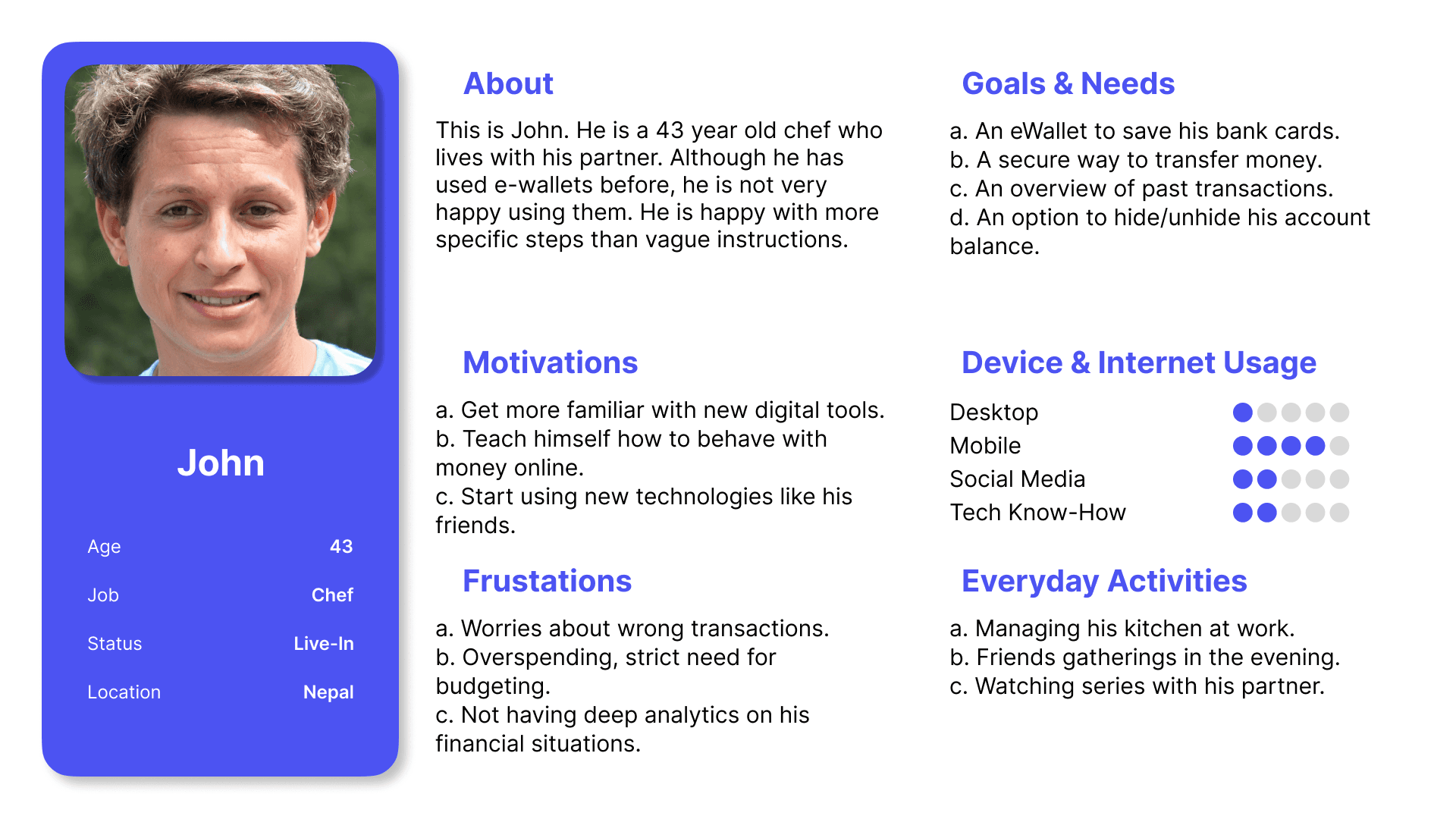
Persona card for John — goals, motivations, and frustrations that drove the design.
User Journey
Journey mapping traced John's experience sending $50 to Nova across three phases: finding the transfer page, entering the amount and confirming, and receiving feedback. Pain peaks appeared at moments of risk — sending money to the wrong person — and ambiguity — unclear limits, hidden fees. We added reassurance checkpoints and explicit confirmation dialogs at each of these peaks.
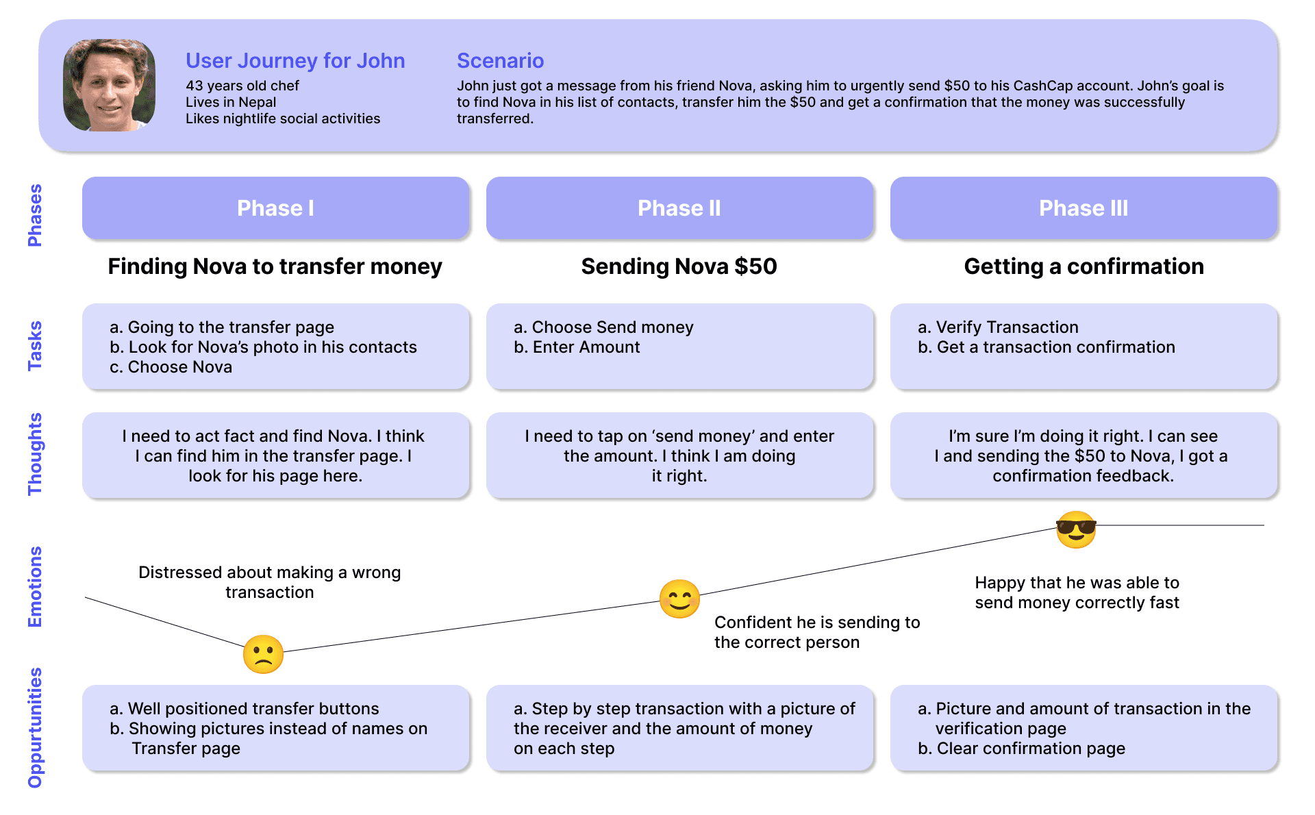
Empathy-driven journey map highlighting pain peaks and reassurance moments.
03
Ideate
Two critical flows were mapped in week 4. “Send Money” follows a three-step path — select contact, enter amount, confirm — with an explicit checkpoint before the transaction commits. “Create Piggy Bank” guides the user through goal, limit, and progress in a sequence designed to feel rewarding rather than administrative. Both flows prioritize reversibility: every action can be cancelled before final confirmation.
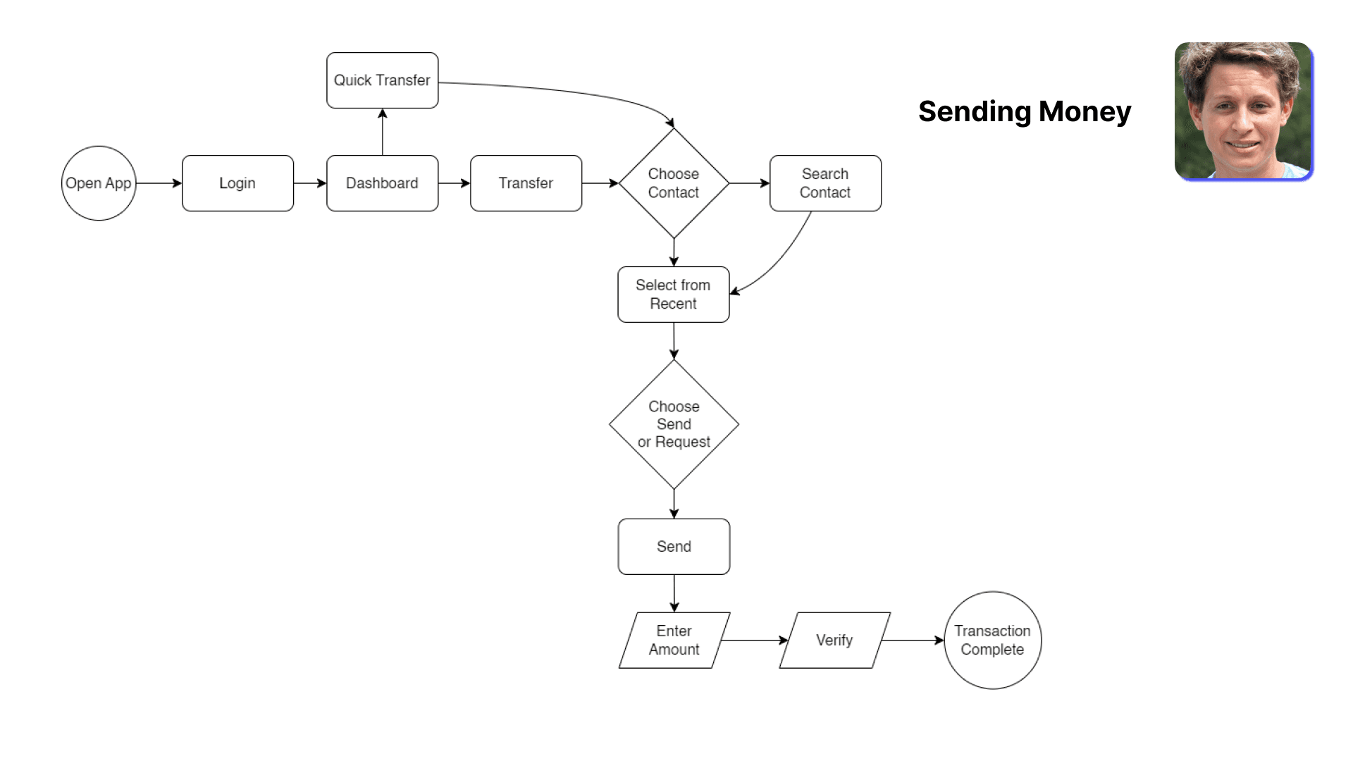
User flows for Send Money and Create Piggy Bank.
Information Architecture
Navigation is deliberately shallow — Home, Payments, Savings, Insights, Profile — so no feature lives more than two taps from the dashboard. This flat structure minimizes cognitive load and keeps every feature discoverable without onboarding.
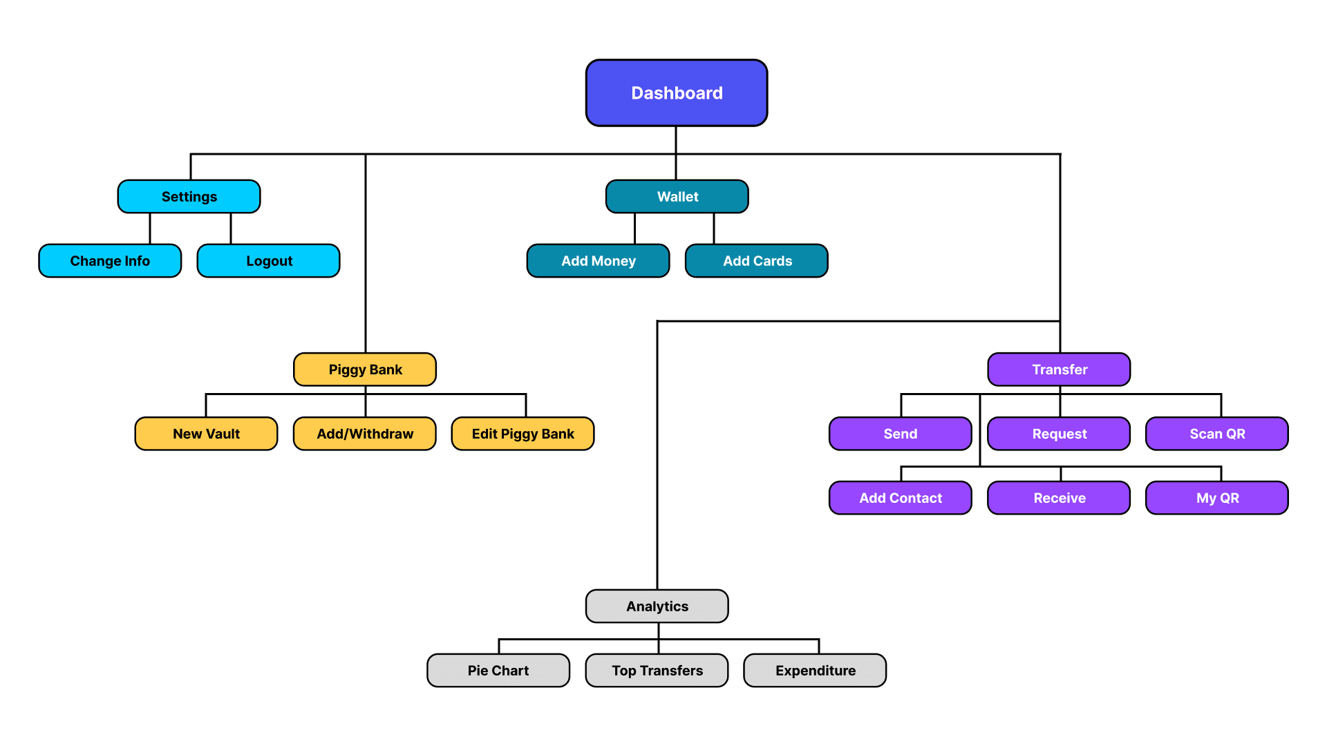
Flat information architecture — everything within two taps.
Paper Wireframes
Early paper sketches explored card density, chart emphasis, and reassurance placement across key screens. The winning direction reduced component variety, grouped actions near related stats for faster scanning, and established a visual hierarchy that carried through to high-fidelity mockups.
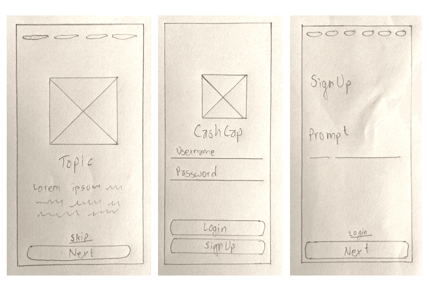
Rapid paper exploration before committing to pixels.
04
Prototype
Week 5 moved from structure to surface. The interface applies Gestalt's law of proximity — grouping related controls tightly — and common region — using cards and containers to define clear boundaries. Shneiderman's golden rules shaped interaction patterns: buttons, fonts, and input fields stay consistent across screens; every tap produces informative feedback through dialog boxes and success/error states; and users maintain control with reversible actions before final confirmation.
Progressive disclosure keeps the surface calm — balance, recent activity, and quick actions appear first, while analytics, settings, and card management reveal on demand. This layering lets new users orient quickly without hiding power from returning ones.
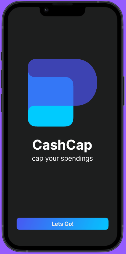
Screens
.png&w=3840&q=75)
.png&w=3840&q=75)
.png&w=3840&q=75)
.png&w=3840&q=75)
.png&w=3840&q=75)
.png&w=3840&q=75)
.png&w=3840&q=75)
Click any screen to enlarge.
05
Test
Week 6 ran moderated usability tests, then grouped findings through affinity mapping. Navigation was praised as simple and intuitive. Step-by-step flows felt clear. The Piggy Bank mechanic noticeably boosted saving intent — participants described it as the feature that made CashCap feel different from existing wallets.
Issues surfaced too: some icon placements confused participants, financial terminology needed simplification, and a few screens lacked feedback messages on edge-case actions. Transfer confirmation also needed clearer visual hierarchy. These findings directly informed the final iteration.
“The Piggy Bank makes me actually want to save. Other apps just show me how much I spent.”
— Usability test participant
Overall feedback was very positive. Users felt their core problems were addressed, and the HCI concepts we applied — Gestalt grouping, Shneiderman's feedback principle, progressive disclosure — proved directly beneficial in guiding the design toward clarity and trust.
Prototype Demo
Interactive prototype — core flows in action.
Reflection
CashCap showed me that financial apps don't have to be complex to be powerful. Grounding every decision in HCI research — from Gestalt principles to Shneiderman's golden rules — gave the team a shared language for evaluating design choices and kept us focused on user needs instead of feature lists.
The Piggy Bank mechanic was the biggest surprise: gamification measurably increased saving intent during testing, confirming that behavioral nudges work when they're simple and visible. On the research side, quantitative survey data gave us concrete targets (33% cluttered UI) while affinity mapping made iteration actionable by sorting findings into clear categories.
If I were to revisit this project, I'd expand the participant pool beyond 24, run longitudinal testing to measure whether saving habits stick, and explore accessibility more deeply. The 6-week sprint format proved that rigorous HCI methodology and fast iteration aren't mutually exclusive — they reinforce each other.
Full Presentation
Full slide deck from the Kathmandu University HCI course.